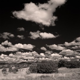

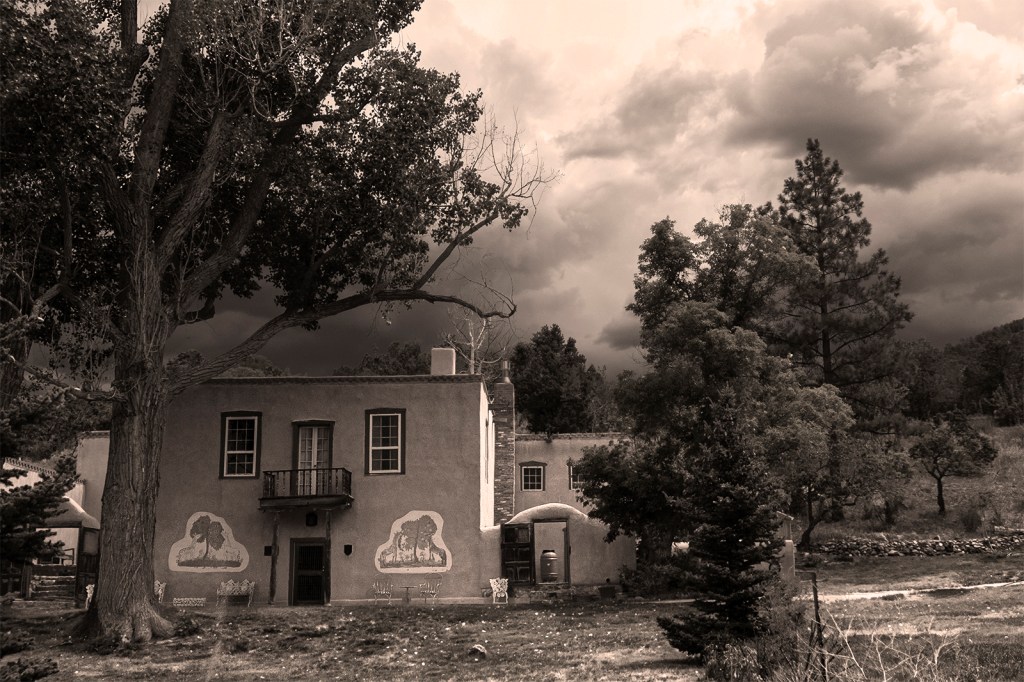
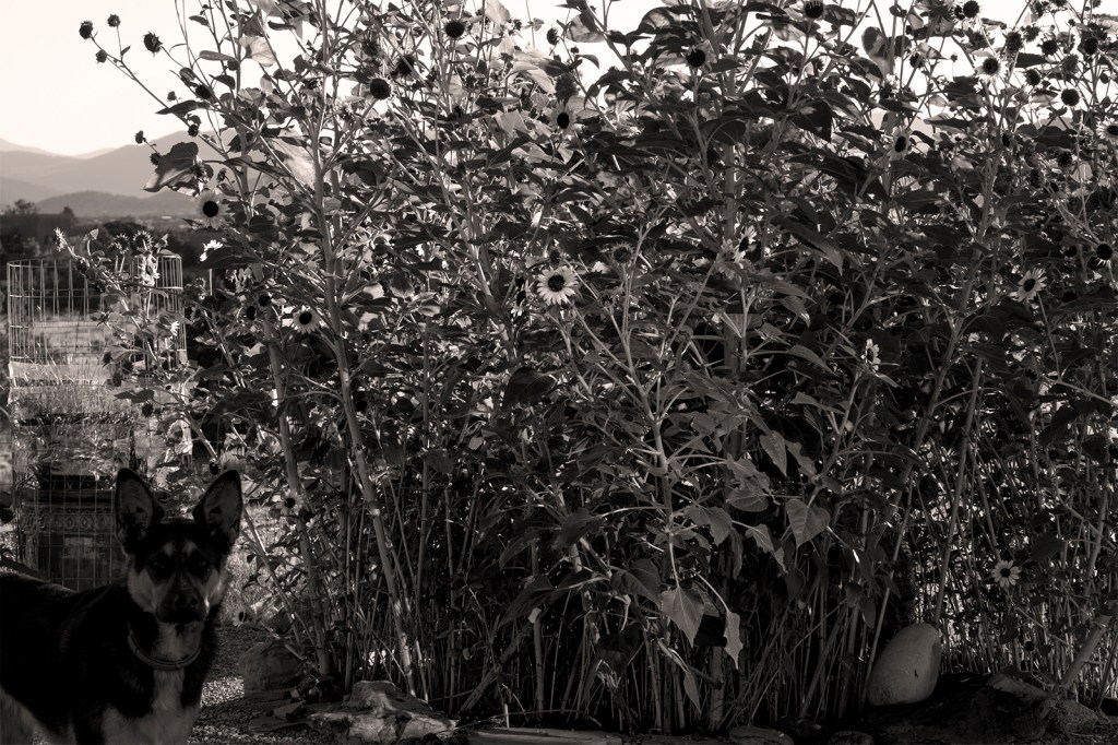
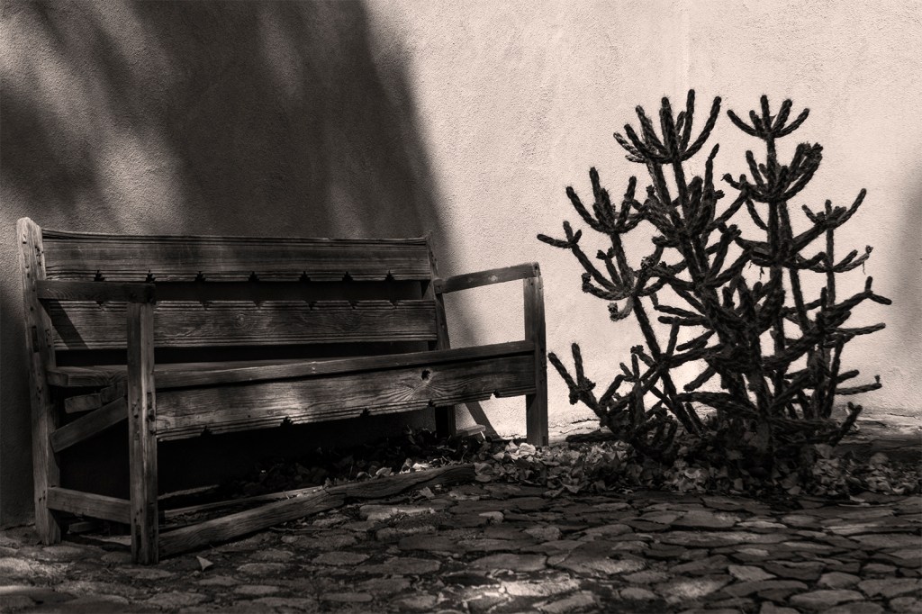
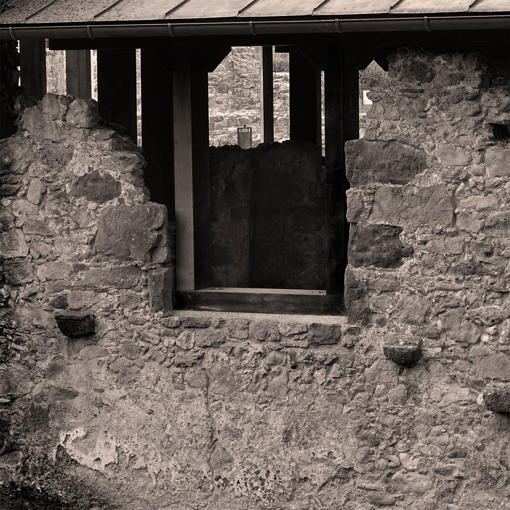
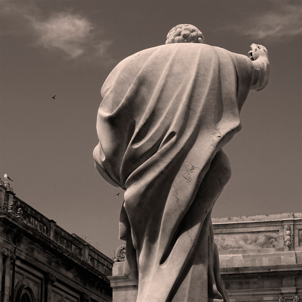
The visit to Sicily was one of the best of my life. I loved the place, the people, everything about it. Maybe it was the history of the place that kept getting to me. It’s unavoidable. It’s everywhere: Greeks, Phoenicians, Arabs, Romans and probably many others as well. Some of the other shots are taken here in Santa Fe, NM.
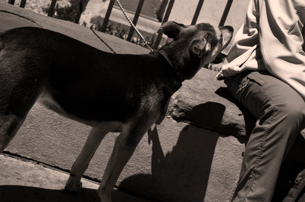
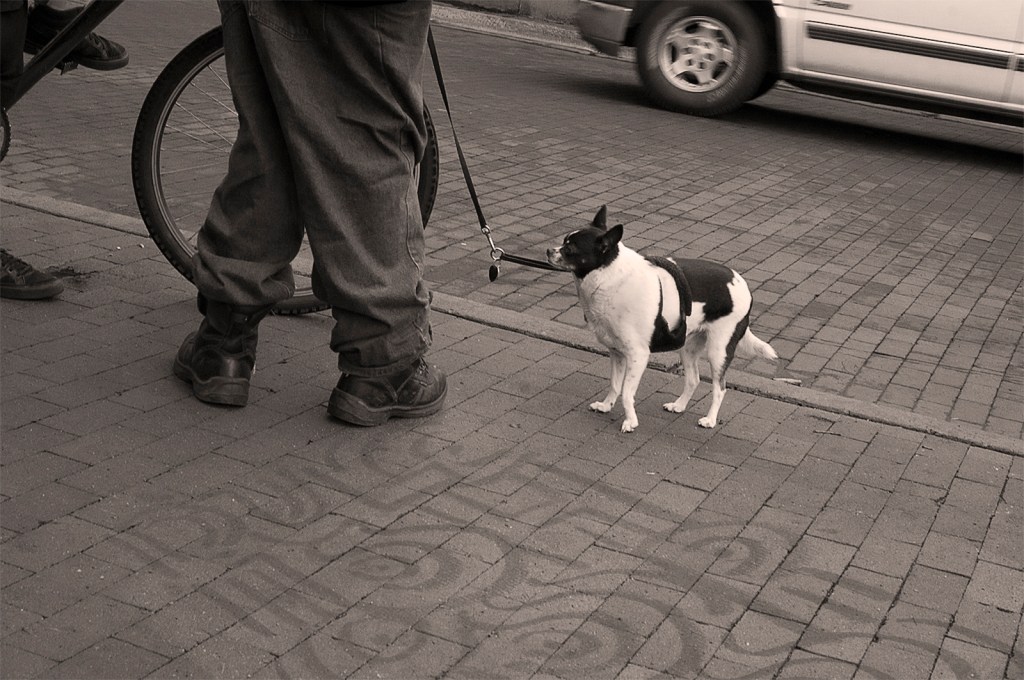
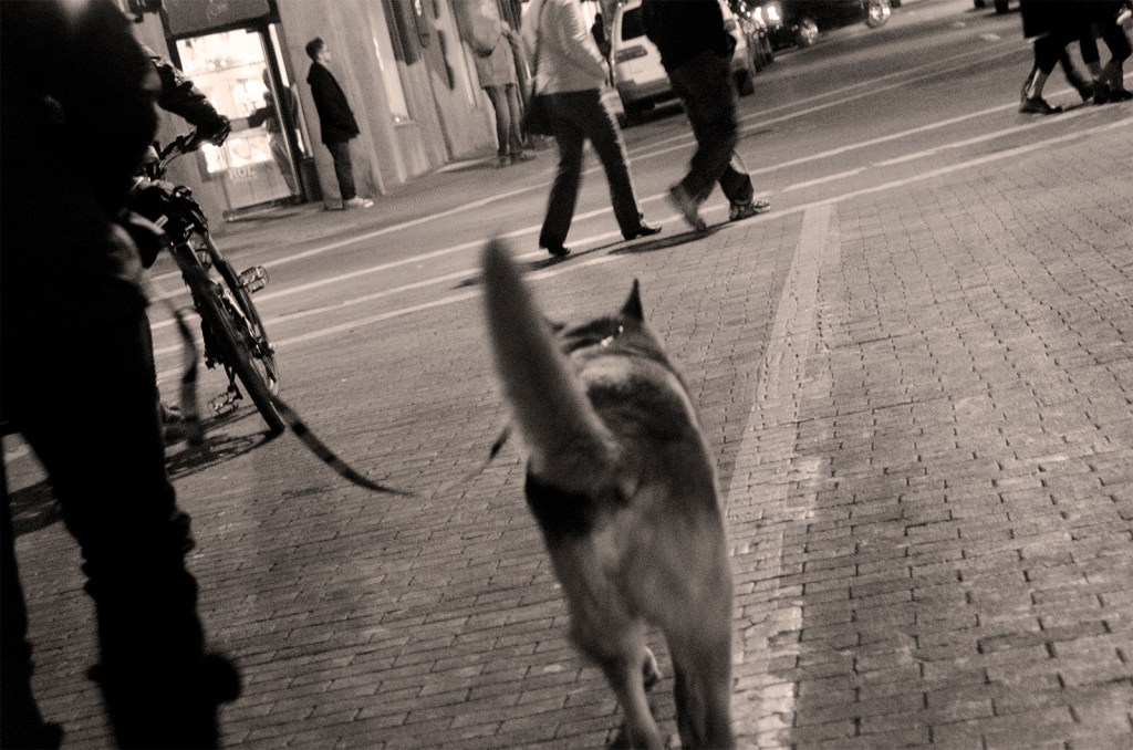
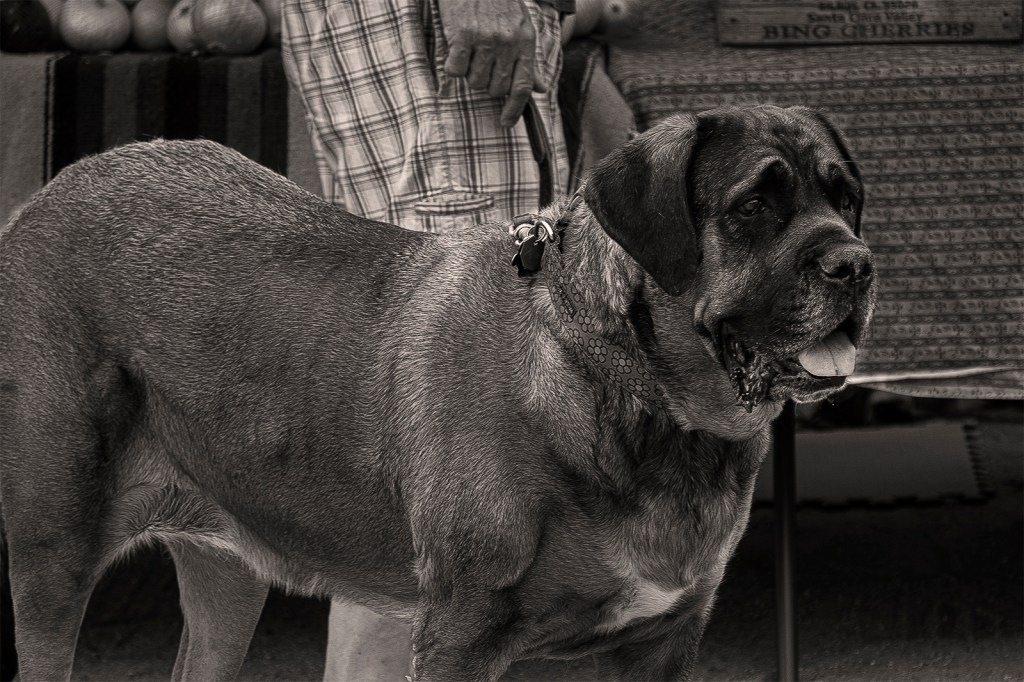
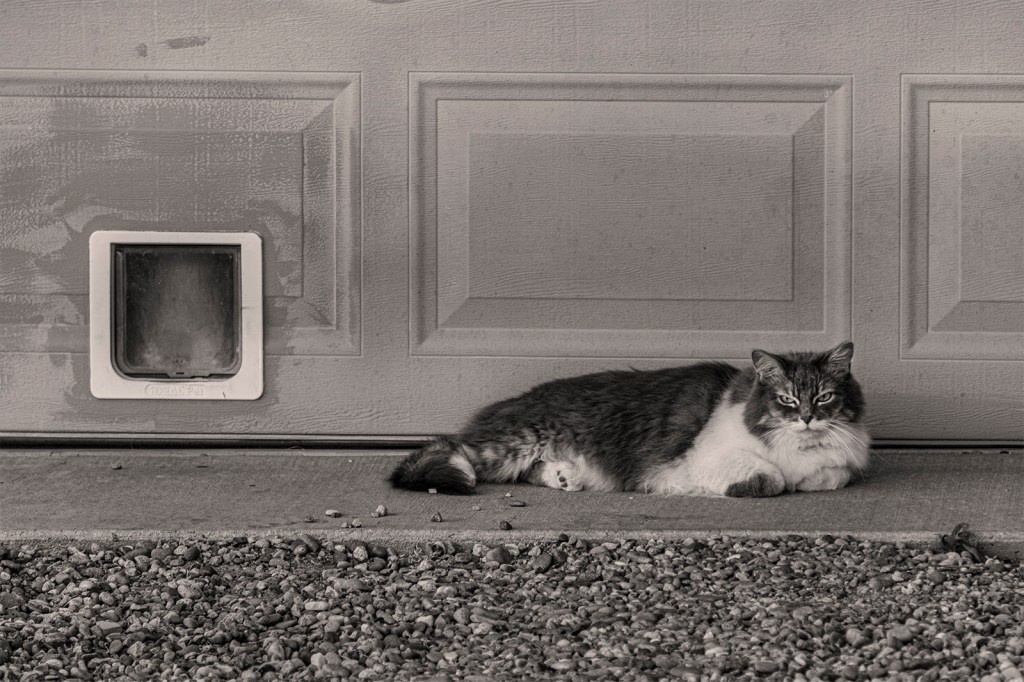
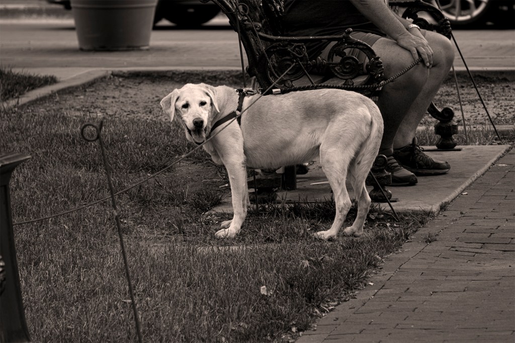
Then, of course, dog pictures. That’s a recurring theme for me. Well, animal pictures in general hold some special allure.
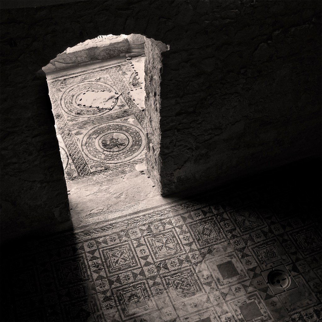
The Roman villas and artwork in the form of mosaics are stunning. The level of craftsmanship and artistry was overwhelming at times. Talk about an embarrassment of riches.

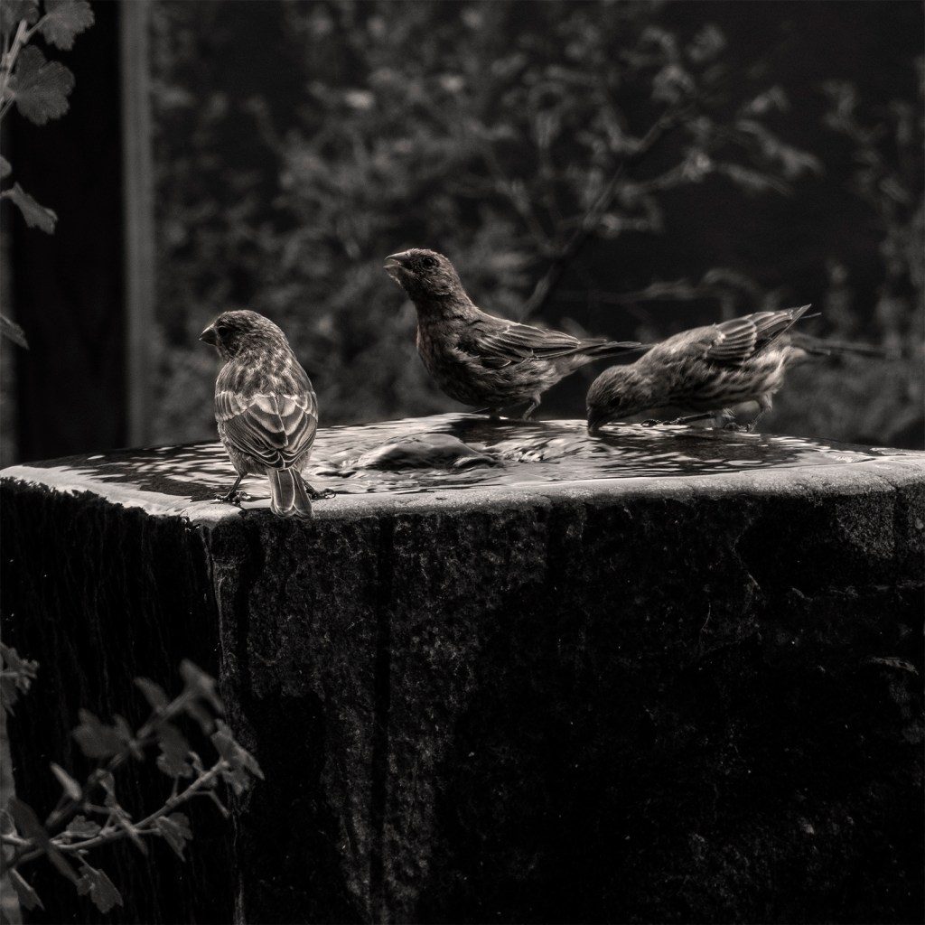
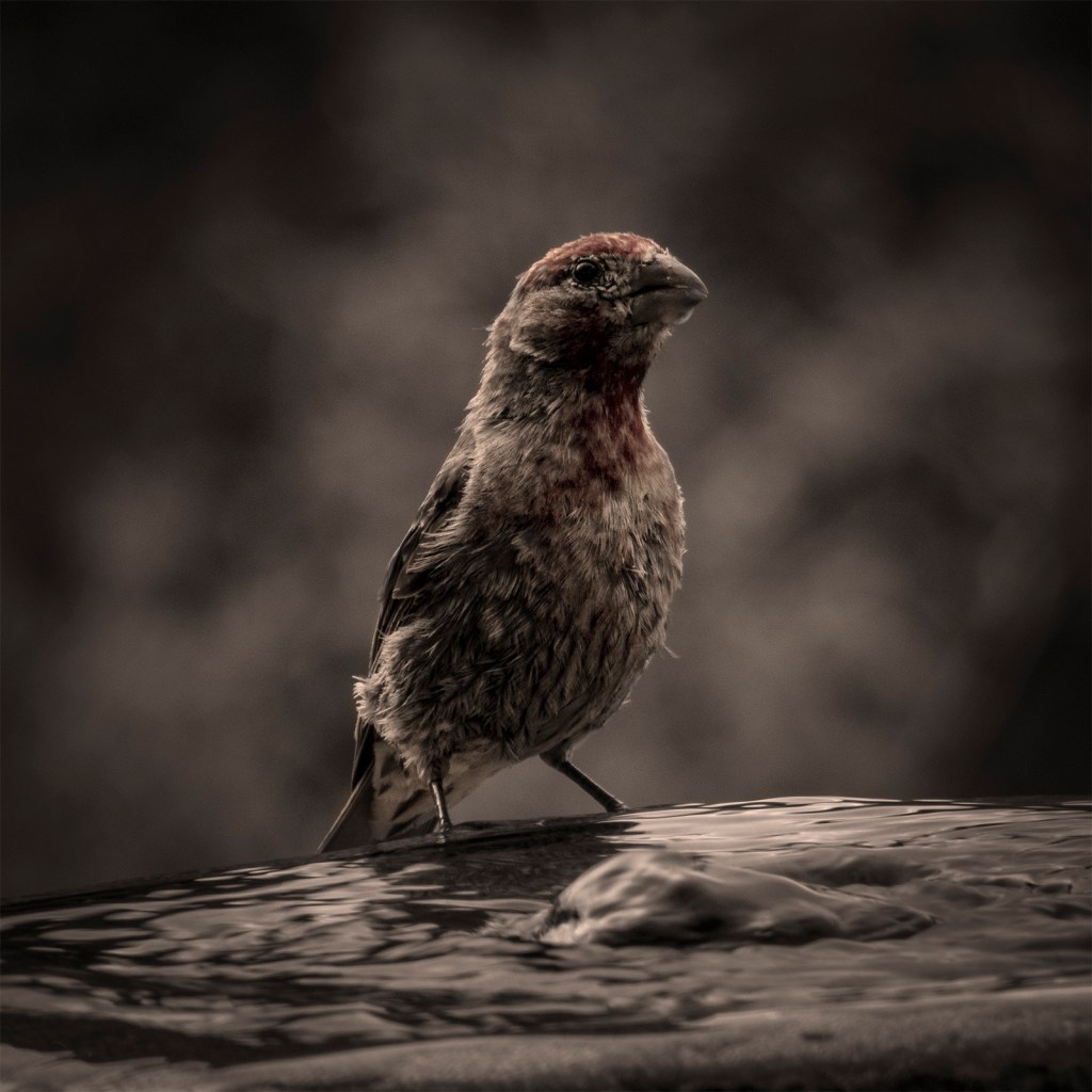
Great photos in tonal values and composition! I can see, at least on my screen, a tinge of sepia is in a few of them? Especially on the third photo of that cute bird…lovely. Think I’ll head back to doing a bit more black and white drawing…and using a bit of sepia toned ink.. Occasionally, I’ve printed photos of my watercolours in black and white… and played about with sepia toning in a print. Your work inspires me to do more of all that! Thanks for sharing your beautiful photos.
LikeLike
Well then, we have a “mutual admiration club”, because I love looking at your art. Yes, there is definitely some sepia on those photos, most of them in fact. I don’t like the steel-gray tone of a digital print. I guess there are a couple of reasons for that. First of all, I come from a traditional darkroom experience. We could control the tone of the printed images by choice of paper and even developing. Secondly, the “palette” that I see, and live with all the time, here in Santa Fe consists of soft, warm pastel tones. So I am influenced by that. I decided to let some color seep through in the solo bird picture. I’m so glad that anything I put up for viewing might positively influence someone! Thanks for sharing that with me. Cheers.
LikeLiked by 1 person
I know wonderful tonal graduations can be possible in darkroom developing and paper choice – my husband used to develop his own photos. Though I don’t know much about it all. Although I’m not doing photography per se, I do find I’ve avoided that “harshness” in a digital print of my iPad or traditional art photos/images, by choosing the right (which is vital!) paper; and with a little photo editing on the iPad.
Of course I can also (like to use my fingertip) make if necessary, changes within an art image, in art app. I’m looking forward to seeing more of your lovely, inspiring photos.
LikeLike