Logo

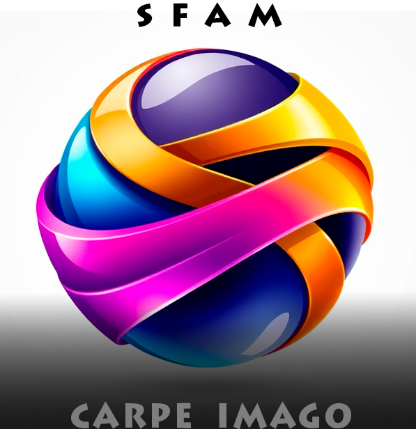
graphic design logo for a photography website

Does a good logo really need an explanation? Some people wanted to see this larger, so here it is. The colors are typical Santa Fe. We’re famous for our turquoise and we even have a trail named after this gorgeous stone.

Aside from the orange and blue being complements, orange is also typical of the tones in our skies and landscapes. That eye is not only my aperture onto the world, it’s the camera’s as well. The face has a relaxed smile and it’s all very gestural and spontaneously drawn. So that’s it. Nice on a T-shirt someday.

Logo. Photography website. Graphic Design.

Leave a Reply

Fill in your details below or click an icon to log in:

WordPress.com Logo

You are commenting using your WordPress.com account. Log Out /  Change )

Facebook photo

You are commenting using your Facebook account. Log Out /  Change )

Connecting to %s